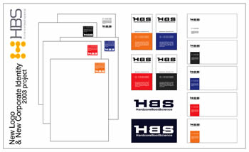
HBS Shoes: New Corporate Image
One of the first shoe manufacturers that trusted the snowboard boot business required brand restyling. Its products and services are of very high quality. Our action was not aimed at drastic changes, but mainly intended to visually approach our customer to the brand perception of sector leaders. The previous triangular logo on a red background was peculiarly recognisable, but “poorly integrated in the freestyle character of the product” (Mktg Research 2002). So, the original lettering was maintained and we obtained a simple and readable graphic result by graphically reversing the letter “B”. The typical lively colours remained in all other materials that make up the coordinated company image.